Release 1.1.1

· 2 min read
sporritt

Release 1.1.1 adds support for rotating label and custom overlays to match their connectors. Here's our flowchart starter app with this functionality enabled:
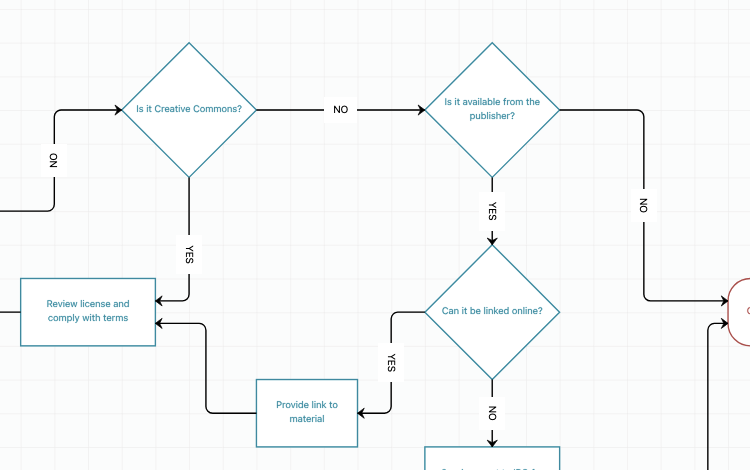
Rotating labels

This feature is supported both in the edges config for a diagram:


import { DiagramComponent } from "@visuallyjs/browser-ui-react"
import "@visuallyjs/browser-ui/css/visuallyjs.css";

export default function App() {

const data = ...

const options = {
edges: {
showLabels: true,
labelsRotatable: true,
targetMarker: "PlainArrow"
}
}

return <div style={{width:"100%", height:"500px"}}>
<DiagramComponent data={data} options={options}/>
</div>
}

and inside the edges defined in a view for an App:
I want my MCP

· 3 min read
sporritt

Integrating an MCP server directly into your development workflow provides a powerful bridge between your IDE and the library documentation you rely on, eliminating the friction of context-switching between your editor and a browser and leading to more accurate, idiomatic implementations and a significantly smoother coding experience.

We are pleased to announce that VisuallyJs now offers an MCP for each of our library integrations. It's so useful that we're actually using it ourselves, both when developing new features and when working on our ever-increasing set of demonstrations and starter apps.

Setup

We provide an MCP server for each of our library integrations, as well as a server that covers every integration.

PackageLibraryCommand
@visuallyjs/browser-ui-angular-mcpAngularnpx @visuallyjs/browser-ui-angular-mcp
@visuallyjs/browser-ui-react-mcpReactnpx @visuallyjs/browser-ui-react-mcp
@visuallyjs/browser-ui-svelte-mcpSveltenpx @visuallyjs/browser-ui-svelte-mcp
@visuallyjs/browser-ui-vue-mcpVuenpx @visuallyjs/browser-ui-vue-mcp
@visuallyjs/browser-ui-vanilla-mcpVanilla JSnpx @visuallyjs/browser-ui-vanilla-mcp
@visuallyjs/browser-ui-mcpAll (Angular, React, Svelte, Vue, Vanilla)npx @visuallyjs/browser-ui-mcp

These are published in the public NPM repository, and, for licensees, our private NPM repository.

If you've done this sort of thing before, the commands listed above will be enough to get you going. To read more about setting up MCP with your library, follow one of these links:

Available tools

Each library-specific package provides tools with unique suffixes, allowing them to coexist in a flat namespace if multiple servers are connected simultaneously. Tools are named following the pattern search_vjs_LIB> for general documentation and search_vjs_LIB_api for API-specific documentation.

For instance, for React, the tools are:

  • search_vjs_react: Search VisuallyJs React documentation.
  • search_vjs_react_api: Search VisuallyJs React API documentation

The other library suffixes are vue, svelte, vanilla and, for Angular, ng.

Examples

You can use the MCP to search all of the publically available docs and apidocs. At VisuallyJs we use IntelliJ's Junie or AI Chat - here's a selection of questions and responses showing the MCP in action.

Zoom-specific content

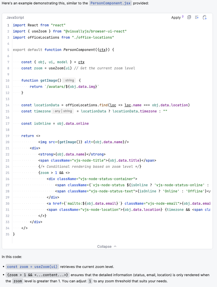
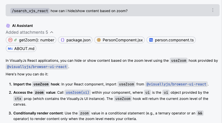
We asked our React MCP how to hide/show content based on zoom, and received this summary:

Hide/show content MCP

followed by this code snippet:

Hide/show content MCP

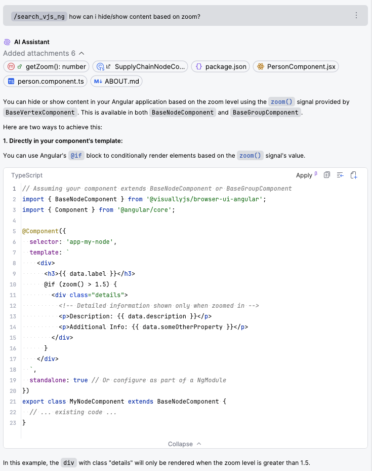
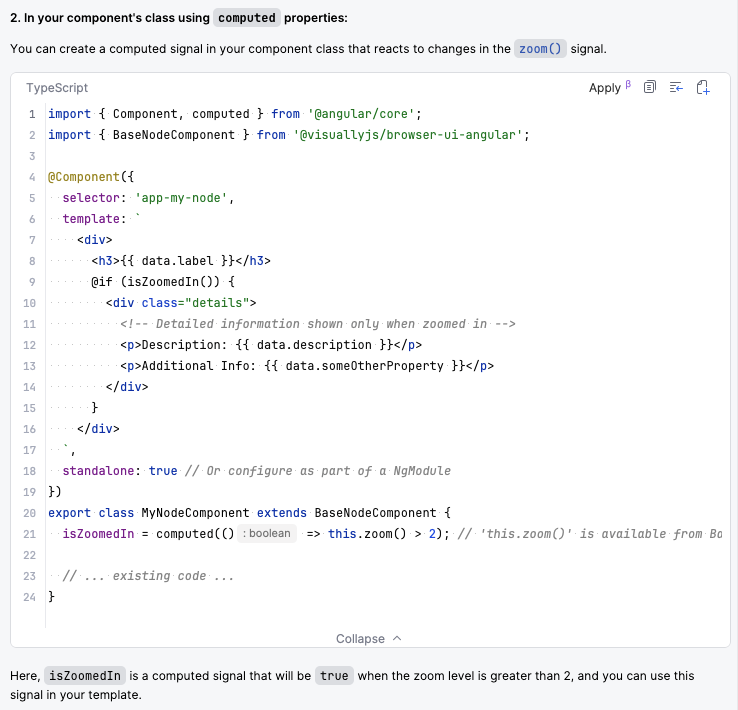
We can ask the same question in Angular:

Hide/show content MCP

Hide/show content MCP

List available anchors

Each of the library integrations has a dependency on @visuallyjs/browser-ui, which contains the core UI concepts. You can search through these - for instance, here, we're asking the React MCP about what anchor types are available:

Release 1.1.0

· 4 min read
sporritt

Release 1.1.0 of VisuallyJs adds a couple of very useful capabilities - a component to manage scrollable lists (such as for data mappers), and the ability to declaratively hide/show content based on zoom level.

Scrolling list manager

Configure a scrollable list with a single DOM attribute.

export function MyList() {
return <div data-vjs-list={true}>
<div data-vjs-port="1">Item One</div>
<div data-vjs-port="2">Item Two</div>
<div data-vjs-port="3">Item Three</div>
...
</div>
}

VisuallyJs will attach a listener to this component and then whenever it is scrolled, edges attached to any of the child elements that are scrolled out of view will be moved so that they are attached to the component's container.

Displaying content based on zoom

In some applications, you might want to display more content on your nodes and groups when the canvas is zoomed in, and less when it is zoomed out, to reduce clutter. In 1.1.0 we've added support for this across our various library integrations.

Use the new useZoom hook to get access to the current zoom as state:

import { useZoom } from '@visuallyjs/browser-ui-react';

export default function ZoomDisplay({ ui, obj, model }) {
const zoom = useZoom(ui);

return (
<div style={{ position: 'absolute', top: 10, left: 10, background: 'white', padding: '5px' }}>
Current Zoom: {(zoom * 100).toFixed(0)}%
{zoom > 1.5 && <p>High magnification active</p>}
{zoom < 0.5 && <p>Low magnification active</p>}
</div>
);
}

Other updates

In addition to these two new capabilities, we've also made a number of small updates:

  • Updated the ForceDirected layout to ensure that attraction/repulsion is clamped to a specific range, to avoid blowouts in positioning.
  • Palette uses .vjs-palette-drag-active and .vjs-palette-drag-hover classes now, instead of using the same ones that are used in the edge drag lifecycle.
  • Improved API docs
  • Fixed issue in Snaplines plugin that would cause it to not reset if drag was aborted.
  • Added the ability to provide sort function to the GridLayout (and ColumnLayout/RowLayout)
  • Fixed positioning issue when labels on a chart were rotated 45 degrees to maximise space
  • Added support for pluggable router

Annotating objects with drag groups

· 8 min read

One of the key differentiators between VisuallyJs and other libraries in this space is VisuallyJs's level of configurability - more often than not you'll find that once you hit a blocker in some other library, VisuallyJs will offer you the ability to do what you need.

A great example of this is VisuallyJs's concept of a DragGroup. Simply put, this is a group of vertices that should be dragged together - but as we'll see, it's not quite as simple as that, and it can be used to great effect with minimal work required on your part.

Active vs passive members

In this canvas, try dragging the large green box around. You'll see the two red boxes drag along with it. Now try dragging one of the red boxes - nothing else moves. This is because all of the nodes are inside a drag group, but the large green node is marked active and the red nodes are marked passive:

Release 1.0.0

· 9 min read
sporritt

We are excited to announce the first release of VisuallyJs.

VisuallyJs builds upon JsPlumb's 17 years of experience providing the foundation for world-class visual applications and diagrams, with a brand new rendering engine which is up to 3 times faster than JsPlumb, modernised integrations with React, Angular, Vue and Svelte, a comprehensive charting engine, a dedicated SVG diagram rendering engine, and a whole host of other additions and improvements.

Solutions

VisuallyJs is a professional solution that can help you get to market in record time with several different types of applications.

Diagrams

In JsPlumb it was possible to create a pure SVG diagram but there was a certain amount of boilerplate that it was necessary to setup. VisuallyJs offers dedicated SVG diagram support that is a snap to include in your page:

import { DiagramComponent, DiagramProvider, DiagramPalette } from "@visuallyjs/browser-ui-react"
import { FLOWCHART_SHAPES } from "@visuallyjs/browser-ui"

export default function MyDiagram() {
return <DiagramProvider>
<DiagramComponent options={{
shapes:[FLOWCHART_SHAPES]
}}/>
<DiagramPalette/>
</DiagramProvider>
}

Charts

VisuallyJs offers a powerful 2D chart engine with support for a number of common charts such as bar/column, scatter/bubble, area, line and pie, as well as more specialized charts such as Sankey. As with diagrams, these are very simple to drop into your page:

import { BarChartComponent } from "@visuallyjs/browser-ui-react"

export default function MyChart() {
return <BarChartComponent options={{
series:[ {valueField:"value"}]
}} data={{...}}/>
}

Apps

VisuallyJs continues JsPlumb's role as the premium solution for apps where the nodes have rich content, and improves upon the ergonomics of JsPlumb's API to make it easier than ever to rapidly create a compelling user experience.

Dashboards

This image shows our Network Infrastructure starter app, in which the diagram canvas and the two charts on the side are all powered by the same model. The possibilities for this are endless.

Updates

VisuallyJs started out as a rewrite of the JsPlumb core engine but ended up becoming something much larger, even getting a new name! Here we present an inexhaustive list of updates made in VisaullyJs.

New Features

  • 3x faster rendering engine
  • Charts module, with support for a number of different 2D charts, and export to SVG/PNG/JPG
  • SVG diagrams module - dedicated SVG renderer, with support for export to SVG/PNG/JPG
  • Diagram tools
  • BPMN shapes - tasks, events, pools, lanes, start, end
  • Support for "click to add" edges
  • Support for edge snap to targets
  • Source/target markers (overlays placed at either end of an edge that the edge does not overlap)
  • Rotate vertices tool

React

  • Modernized API - streamlined and easier to use
  • DiagramComponent
  • ChartComponents
  • InspectorComponent refactored to be far more simple to use
  • MiniviewComponent, ControlsComponent, ExportControlsComponent and InspectorComponents can now be declared in your JSX as children of a SurfaceComponent

Angular

  • Modernized API - streamlined and easier to use
  • A default component is now used for nodes/groups if you do not map one in your view - helpful for rapid prototyping or UIs that dont need complex content.
  • Miniview, Controls, ExportControls and Inspector components can now be declared in your template as children of a Surface component

Vue

  • Modernized API - streamlined and easier to use
  • Added Surface/Diagram providers, allowing for easier composition of UI
  • Added injectable VisuallyJs service, exposing the Surface/Model/Diagram that is in the current context for some component.
  • All starter apps are now available for Vue

Svelte

  • Modernized API - streamlined and easier to use
  • Added Surface/Diagram providers, allowing for easier composition of UI
  • All starter apps are now available for Svelte

Miscellaneous updates

  • Hierarchy layout option to align leaves on final layer
  • Improved UX for the orthogonal + bezier connector editors
  • Improved documentation
  • New look and feel for controls, miniview and resize tools
  • Full support for groups and nested groups in the SVG renderer
  • SVG shapes updates - new Label shape, shapes publish properties, ShapeLibraryInspector
  • Template updates - ability to use the '||' operator in attribute values. Applies when using Vanilla templates and also in the chart and shape library templating.
  • Controls component "clear selection" button
  • Snaplines plugin now takes rotation into account
  • The ResizingToolsPlugin registers a drag filter on the underlying Surface, meaning you no longer need to add one in your render options.
  • The updateNode and updateGroup methods now set the position of the vertex's DOM element if the update includes left or top (or, for a Diagram, x or y) values. Previously you had to use setPosition(..) and then storePositionInModel(..)
  • Adhoc layouts are now run inside a transaction, and can be undone/redone.
  • Added support for cornerRadius to Segmented connector.
  • Added support for panWithMetaKey option to the Surface. With this set, users need to hold the meta/ctrl key in order to instigate a pan.
  • Added support for auto entering edge edit mode when user taps (and auto exit when they tap whitespace in the canvas)
  • Miniview elements now move as their related surface element is being dragged, unless you set dynamic:false on the miniview.

Breaking changes

This section details the changes that will require resolution for current users of JsPlumb who are upgrading to VisuallyJs. VisuallyJs is 100% functionally backwards compatible with anything that had not been deprecated in JsPlumb.

General

  • IMPORTANT: The Size interface was changed from {w:number, h:number} to {width:number, height:number}. This is a small change from a code perspective but with far-reaching effects - any part of a JsPlumb app in which you specify a size for something, be it a grid, or the size of icons in a shape library palette, or the max size for a group, etc, will need to be updated for VisuallyJs to use the new interface. We made this change to make the code more internally consistent: width/height were used by the drawing tools and are also standard for various DOM interfaces.
  • The default anchor is now Continuous, where previously it was Bottom.
  • The concept of Endpoint has been removed. From a visual perspective, you can replace endpoints with the new Dot, Rectangle and Ellipse overlays, optionally registered as markers.
  • Orthogonal connectors no longer support loading data in the JsPlumb 2.x format.
  • The legacy-json datatype, in which ports are listed at the top level alongside nodes, groups and edges, is no longer supported.
  • The list manager, which was part of JsPlumb Community edition, was removed.
  • The concept of a data manager - an add-on that responds to changes in the data model - was removed. This functionality can be modelled, if desired, by listening to appropriate model events.
  • Dotted notation for left/top values in vertex backing data is no longer supported. Your left/top properties must be in the top level of the backing data for each vertex.
  • Removed constant CLASS_DRAG_SELECT_DEFEAT - it was a duplicate of CLASS_SELECT_DEFEAT

Drag/Drop

  • SurfaceDropManager and DropManager have been replaced with a new class Palette. This class has several enhancements to the previous classes:

    • it has a click mode where the user can select an item in the palette and then click on the canvas to drop it
    • it supports ignoreDropOnNode, a flag indicating that the palette should just ignore nodes altogether, and whenever something is dropped on a node or hovering over a node, the palette treats it as if it is over whitespace on the canvas

Surface

  • Removed autoExitSelectMode flag from the surface render options. To set this up now you should provide an autoExit flag to the lasso plugin.
  • Removed enhancedView flag from the surface render options. This behaviour is always switched on now.
  • Removed addToDragSelectionOnSelect from the surface render options. What this means is that in VisuallyJs if you have one or more vertices in the current selection, they will not be dragged when some other vertex (not in the current selection) is dragged. This probably seems intuitive to you, which is why this flag has been defaulting to false and has now been removed. Use drag groups, or add all nodes you want to drag to the current selection, to drag multiple vertices.
  • Removed refreshAutomatically flag from the surface render options. This behaviour is permanently switched on in VisuallyJs.
  • Removed storePositionsInModel from the surface render options. This behaviour is permanently switched on in VisuallyJs.

Nodes/Groups

  • filter in the surface dragOptions is now a function. cssFilter has been introduced to replicate what filter used to do.

Edges

  • Edge geometry uses an object based syntax now instead of array based.
  • simpleEdgeStyles in render options has been moved into the new edges option (instead of simpleEdgeStyles:true you now need {edges:{simpleEdgeStyles:true}})
  • propertyMappings in render options has been moved into the new edges option (instead of propertyMappings:{...} you now need {edges:{propertyMappings:{...}}})
  • editablePaths in render options has been moved into the new edges option (instead of editablePaths:true you now need {edges:{editable:true}})
  • slightlyWonky option removed from Orthogonal connector

Plugins

  • The DrawingToolsPlugin has been renamed to ResizingToolsPlugin, and the associated .jtk-draw-... classes have all been renamed to .vjs-resize-.... The type has changed from "drawingTools" to "resizingTools" (but its best to use ResizingToolsPlugin.type in your render options instead of a string anyway)
  • The ActiveFilteringPlugin was removed, replaced with an activeFiltering option in the render options to a surface.

Angular

  • Components are prefixed with vjs- instead of jtk-

Vue

  • Vue 2 Integration removed. Vue 2 reached EOL on December 31st 2023 and is no longer receiving new features, updates or bug fixes.

CSS

  • The default stylesheet now declares position:absolute for .jtk-miniview (previously this was position:relative).
  • Class names are prefixed with vjs- instead of jtk-.