Multiple series, stacked, grouped, pivoted, and much more
Get the code
Grab the source code from Github and start working on your new app right now!

- React
- Angular
- Vue
- Svelte
npx degit [email protected]:visuallyjs-react/bar-column-chart bar-column-chart
npx degit [email protected]:visuallyjs-angular/bar-column-chart bar-column-chart
npx degit [email protected]:visuallyjs-vue/bar-column-chart bar-column-chart
npx degit [email protected]:visuallyjs-svelte/bar-column-chart bar-column-chart
What is a Bar / Column Chart and how can I develop one using VisuallyJs?
Bar and Column charts are fundamental data visualization tools used to compare different categories of data. A bar chart represents data with rectangular bars where the length of each bar is proportional to the value it represents, while a column chart uses vertical bars for the same purpose. They are ideal for showing changes over time or comparing discrete items.
With VisuallyJs, creating highly interactive and customizable Bar or Column Charts is simple and efficient. By leveraging its integration with leading web frameworks, developers can build charts that support advanced features like real-time updates, custom tooltips, and responsive layouts, providing a superior user experience for data exploration.
Angular Bar / Column Chart
Building Angular Bar and Column Charts is a breeze with VisuallyJs. Our Angular Bar / Column Chart starter app provides all the necessary components and services to get you started, enabling you to deliver professional-grade visualizations in your Angular projects.
React Bar / Column Chart
React Bar and Column Charts are easily implemented using VisuallyJs's React-specific tools. The React Bar / Column Chart starter app utilizes React's declarative style and VisuallyJs's providers to create flexible, high-performance charts for any application.
Vue Bar / Column Chart
Create interactive Vue Bar and Column Charts effortlessly with VisuallyJs. The Vue Bar / Column Chart starter app shows you how to integrate our charting plugins and components into your Vue application, ensuring a seamless development process.
Svelte Bar / Column Chart
VisuallyJs offers excellent support for Svelte Bar and Column Chart development. Our Svelte Bar / Column Chart starter app provides a streamlined approach, leveraging Svelte's reactivity to build fast and responsive data visualizations.

Need some help?
We can build your app for you - in React, Angular, Svelte, Vue or Javascript/Typescript. Our team has 17 years of experience building visualisations and interactive UIs across a wide range of industries. Read more about what we can offer here, or click here to fill out a quick form detailing what you need, and we'll be in touch.
More apps
Chances are we've got something you can use to get you started. Don't see what you need? Contact us! We're always looking to expand our list of apps and feature demos.
Call Flow

Use VisuallyJs to build a visual Call Flow editor
AI Agent Builder

Use VisuallyJs to create an advanced AI agent builder
Chatbot

Use VisuallyJs to build a Chatbot editor, with actions, messages, input and choices
Flowchart

Fully featured flowchart builder including support for custom shapes, edge routing to avoid vertices, shape resize/rotate, SVG/PNG/JPG export and more
BPMN

BPMN editor for modelling the steps of a business process. Pools, lanes, and a full set of task, event and gateway types
ERD

ERD editor for modelling the steps of a business process
Gantt

Interactive Gantt chart featuring tasks, task groups and milestones
Kanban

Fully featured Kanban board. Drag items between columns and use the inspector to update items and columns
Database Schema

Database Schema builder with support for tables, views, multiple columns types, and column relationships
Org Chart

Uses the classic org chart layout and provides an inspector from which the user can navigate around
Circuit Diagram

Fully featured starter app containing a circuit diagram builder
Scada/HMI
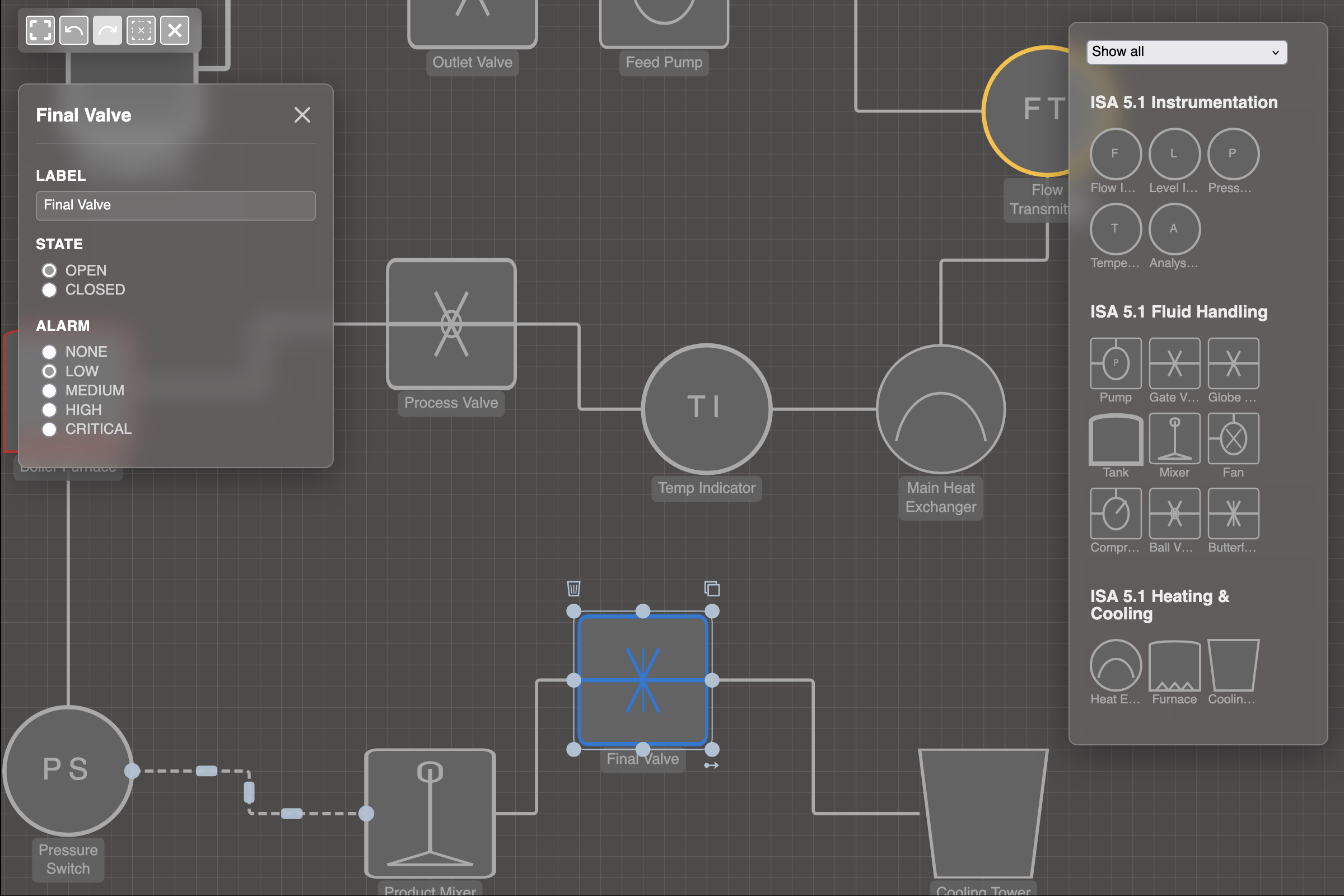
Professional and modern Scada/HMI application with fluid, heating/cooling & instrumentation shapes, adhering to the HMI ISA-101 Design Standard
Mindmap

The mindmap builder highlights several advanced features, such as custom layouts, parsers and exporters
Neighbourhood Views

Demonstrates how to include multiple views of a dataset on one page
Logic Gates

Fully featured starter app containing a logic gates diagram builder
Template

Basic starter app demonstrating how to setup VisuallyJs and its main features
Area & Line charts

Use VisuallyJs to create area and line charts
Bar & Column charts

Multiple series, stacked, grouped, pivoted, and much more
Scatter & Bubble charts

Circle, rectangle, triangle or custom markers, multiple series, fully customizable
Sankey chart

Use VisuallyJs to create a professional Sankey chart, with support for pivoting
Supply Chain Analyzer

Dashboard for managing and analyzing supply chains
Network Infrastructure

Combine a network management diagram with charts showing projected cost and resource usage
Scrolling Lists

Use the ListManager plugin to manage scrolling lists: as elements are scrolled out of the view, their edges are moved to the list container
FIFA World Cup

A visualizer for the FIFA World cup - group stages, team journeys and a tournament view.
Fault Tree Analysis

Combines a fault tree analysis diagram with charts showing risk and list of cut sets