Visualizing flight search results with charts

In a previous post I mentioned a book that introduced to me the concept of the "data-ink" ratio - the amount of ink used to represent data vs the total amount of ink used to draw the entire image. At that time I was working for a travel company, and I was so enamoured with this book that I instantly went off and started designing prototypes for alternative ways we could present our users with the results of their searches.
None of my ideas were adopted: I couldn't find a champion amongst the middle managers. But that didn't make me think they were no good. One of my favourites was what I'm going to talk about today - flight search results using a scatter chart.
Searching for flights
When I search for a flight I most often have:
- a general idea of when I want to depart
- a budget
- a personal list of airline preferences
- a preference for getting there quickly, but
- an aversion to flights longer than 15 hours
So I go to a booking engine and enter my details on the form, and I get a list of flights. I now have to go through this list of flights comparing them all to decide which one I want to book.
HorizonSkyway
Emerald Express
Swift Lines
North Orbit
Royal Express
North Orbit
Alpine Ways
Alpine Ways
Royal Express
BlueFly
Emerald Express
Emerald Express
Blue Air
Swift Lines
NorthWings
NorthWings
Royal Express
Swift Lines
Horizon Orbit
HorizonSkyway
Swift Lines
Swift Lines
NorthWings
Horizon Orbit
Blue Air
Swift Lines
Alpine Ways
North Orbit
Making my choice from this list of flights is not just a question of which one is the cheapest - I have a list of criteria above that I want to apply to this decision, and being presented with a list, even if it has sorting functionality, still makes the task quite onerous.
Scatter chart results
What if, instead, I could view this list of flights in a way that I could determine several facts at once? Enter the scatter chart.
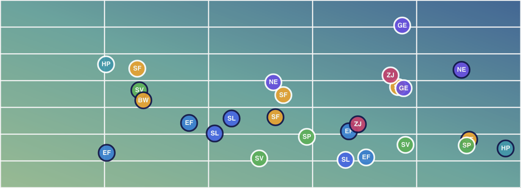
In this view we show the price for each flight along the X axis, and the duration of the flight on the Y axis. Since I want the cheapest and quickest flight, I'm going to be looking for the one that is closest to the bottom left corner:
...and in this dataset there are two candidates - a Horizon Skyway flight for $561 that takes 19h 35m, and an Emerald Express flight for $674, taking 19 hours and 7 minutes. But what's that North Orbit flight at the bottom there? It's a little more expensive, but I can see it's only 17h 30m. This is a business flight...hang the expense, I'll take it. That was the sixth result in my flight list - but with the scatter chart view I was able to immediately see it was the one I wanted.
Picking different criteria
We can choose a different value to plot on the y axis if we want to - here's a view where the Y axis plots how far away from my ideal departure time each flight departs:
You can use the drop down to switch the y axis field.
Adding extra dimensions
You may or may not have noticed, but the drop down contains a Baggage Allowance option - that's one of the fields stored for each flight. We can assign this to the Y axis if we want, but it doesn't give us the best result:
Aside from the fact that all of the flights are arranged in two lines (due to the fact that the flights in the dataset offer either one checked bag or two), the chart also suggests that there could be such a thing as "1.5 bags". We could fix that last issue by specifying our own labels, or specifying that the label step should be 1, but that would be to ignore the fact that baggage allowance does not really make sense for the Y axis. It would be great to show the user, though - so an alternative approach is to add this piece of knowledge to the markers in the scatter chart. We'll use the marker's outline for this - red means 1 bag, green means 2 bags:
Oh no! I've just discovered that the North Orbit flight I wanted to book only allows one checked bag. Maybe I should go for one of the others after all? Hmm no, the cheaper flights are one bag only too. Maybe I should look at that Alpine Ways flight that's reasonably short and not much more expensive? With this scatter chart view I can assess all of my options quickly and easily.
Polishing
Although we just discovered that the item closest to the bottom left corner is not always the one to pick, it is true that in general that the closer to the bottom left corner of the chart a flight is located, the more you'll want to consider it. So one nice piece we can add is a gradient which leads the user's eye to that point. We've also made the grid and the chart labels white against a dark background, and we switched our red/green outlines for baggage to use white/dark instead. In my previous article about data ink I used red/green but I don't think that's the nicest experience for someone who has a color vision deficiency.
Building scatter charts with VisuallyJs
This page makes use of VisuallyJs's powerful and flexible charts API - it's a React app but we offer the exact same set of components for Angular, Vue and Svelte. Charts in VisuallyJs follow the same API design principles as the rest of VisuallyJs: sensible defaults, and a balance of API complexity to features.
To embed a chart in your app:
<ScatterChartComponent data={flights} options={options}/>
Our options contains config for:
- the chart's data series;
- the title and labelling of the X axis
- the title and labelling of the Y axis (we use a custom label formatter in this chart, which returns different values based upon the current Y axis)
- a spec for a tooltip to show on hover
return {
  series: [
  {
    id: "flights",
    xAxisField: "price",
    yAxisField: yAxisField || "durationHours",
    resolveMarker: (point) => getAirlineIcon(point.airline),
    markerSize: 32
  }],
  xAxis: {
    title: {
      text:"Price ($)"
    },
    labelPrefix: "$"
  },
  yAxis: {
    title: {
      text: isVariance ? "Departure Variance (hours)" : (isLuggage ? "Baggage Allowance (bags)" : "Duration (hours)")
    },
    labelFormatter: (value) => {
      if (isLuggage) {
        return `${value} bag${value === 1 ? '' : 's'}`;
      }
      const hours = Math.floor(value);
      const minutes = Math.round((value - hours) * 60);
      return `${hours}h${minutes}m`;
    }
  },
  tooltip: {
    format: "<b>{{point.airline}}</b><br/>Dep: {{point.departureTimeFormatted}}<br/>Arr: {{point.arrivalTimeFormatted}}<br/>{{point.duration}}<br/><b>${{point.price}}</b>"
  }
}
Summary
Have any comments? Drop us a line via the contact page - we love to chat about this sort of stuff.
Try VisuallyJs
VisuallyJs offers an extensive list of starter apps, diagrams, charts and dashboards to quick start your development, in React, Angular, Vue, Svelte and Typescript/Javascript.