Visualizing flight search results with charts
· 7 min read

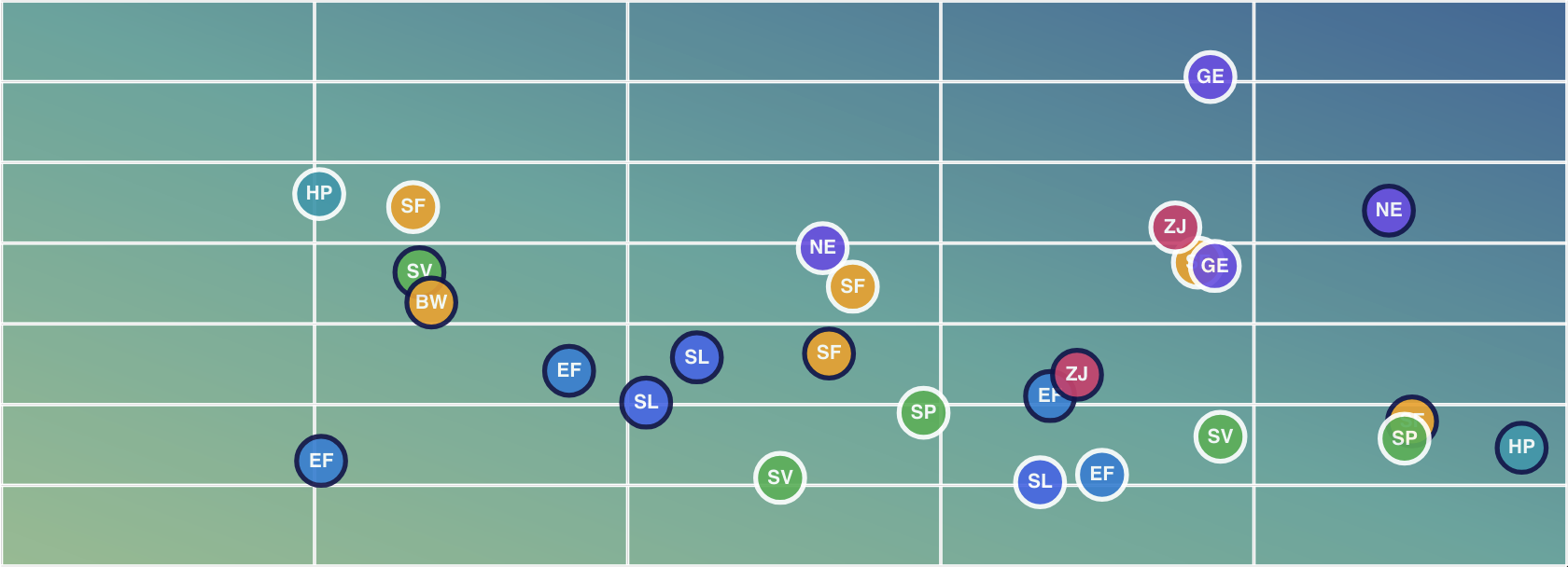
In a previous post I mentioned a book that introduced to me the concept of the "data-ink" ratio - the amount of ink used to represent data vs the total amount of ink used to draw the entire image. At that time I was working for a travel company, and I was so enamoured with this book that I instantly went off and started designing prototypes for alternative ways we could present our users with the results of their searches.
None of my ideas were adopted: I couldn't find a champion amongst the middle managers. But that didn't make me think they were no good. One of my favourites was what I'm going to talk about today - flight search results using a scatter chart.
Searching for flights
When I search for a flight I most often have:
- a general idea of when I want to depart
- a budget
- a personal list of airline preferences
- a preference for getting there quickly, but
- an aversion to flights longer than 15 hours